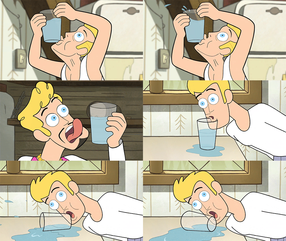
“Ahhhh! You’re doing it wrong!”
— Said every designer watching their first usability test
I know exactly how you’re feeling right now. The Usability Debt your project has been accumulating just punched you in the face. And it really hurts.
If you don’t control your Usability Debt, your Usability Debt will control you.
It’s been a few years since my first usability testing session, but the bruises are still healing. I remember feeling shocked, slightly embarrassed and honestly a little angry during the play testing sessions I ran at a game studio. I was having a hard time comprehending how people were struggling doing something that seemed so obvious to me.
In my head I was screaming:

Come on…it’s simple! No one on the team had troubles…and I’ve been able to beat this level for months now.
Holding back the scream, and gentle neck massage I was about to give out, I calmly explained to the first participant playing the video game to stop acting like an idiot and ACTUALLY PLAY THE GAME THE WAY IT WAS SUPPOSED TO BE PLAYED. (I didn’t say that either…just really wanted to)
After watching this person fumble through our test level for 30 minutes, I was thinking there is no way he accurately represents a real player in this genre. He must have figured out a way to bypass the screening process and was just here to get the compensation at the end of the session.
Yep, Fer sure.
So…after the waste-of-time session was over, I kindly thanked him for his feedback , gave him compensation for coming in and promptly chalked this session up to “not our target audience”.
And then the next person did the exact…same…thing.

Damn.
Your development plan is totally bullet proof…until you get feedback.
Questions were burning in my head:
Why are people having so much trouble with this?
How did we get so far off the mark?
Am I going to be fired…?
But let me back up…
A month or so before the train wreck of a usability test happened, I was super excited! This was the first time in the history of our studio we had facilitated in-house play testing with people (other than ourselves that is) and we were going to rock…wait for it…it.
And leading up to this, we were well prepared to rock it.

We had followed a solid design and development process…the tech was cutting edge…and the IP was hot at the time. How could we lose?
After a month or so of internal high fives, we came up with the plan.
The plan
Get feedback from our first playable level in order to:
- Assure the Publisher this game was a hit
- Validate the development road-map
- Make lots of money
Boom
Yep…awesome.
You are not the user.
Back to the panic inducing seizure I was about to have…
I was thinking…OK, so how did we get here aaaand how can this be turned into something positive?
Besides breathing into a paper bag, I needed to start with the basics:
Observing people interacting with your product or service is the best way to gather insights for improvement.
OK, got it. Pay attention time.
Here is what I was seeing:
Observation: Majority of users are running into dead ends.
Finding: All of the “obvious” signals we added…are not so obvious to them.
That’s not so bad…we can fix that. So what’s next on the list of basics…
While running a moderated usability test, you need to ask the question and then just listen. You have two ears and one mouth for a reason.
Right. But I still totally want to tell them where to go and what to use to get through this level, I mean it’s right there…but I get it, I can’t be shipped with the game to help them get through it. Fine.
Here is what they are telling me:
Quote: “Game play is not intuitive at all. This is really complicated”
Finding: This level does not clearly introduce the basics of the game to help the player understand what to do.
Sweet! We were talking about adding a few levels that only used the simple mechanics anyway. This totally solidified that. Next song!
You are not the user. You are not the user. You are not the user. Got it yet?
But I play this type of game all the time! So I’m the perfect user. I know what is good and what is bad and…….wait. I…
- prefer certain things
- have very specific opinions
I get it now. I don’t represent all game players in this genre. If anything, I am an advanced player type in this genre.
Crap.
Here is what was happening:
Task Completion Rate: 9 out of 10 players failed to get past the first puzzle.
Finding: The first puzzle requires many sequential steps to complete and there is no indication that a step has been missed.
Hmmm. This might take a little more thinking power, but I can take this back to the level designers and I’m sure we can figure out something.
Sometimes you learn more from failure than from success.
“Challenge Accepted!” -Barney Stinson
OK, I got this.
At this point I was feeling a little better about the sessions and how I was going to approach management with our insights. And although it wasn’t going to be as awesome, I was starting to formulate a new, more thought through plan that would help us make a better game.
Here are some of the things the new plan would include:
1 — Control Usability Debt during development
- Use common patterns first…experiment later
- Everything added to the game should add value to the player
- K.I.S.S
2 — Facilitate monthly feedback sessions with each of our player Personas
- Game Mechanics
- Levels
- Updates/Fixes
3 — Capture UX measurements and metrics to improve the Usefulness, Usability, Learn-ability and Desirability
- Task Completion
- Satisfaction Ratings
- SUM
- SUS
- NPS
and the most important of them all:
4 — Stay objective (You are not the user)
Have usability testing bruises you want to show off? Respond with your stories below.
About Handrail
We built Handrail to help teams collaborate throughout the entire user research process. Plan, collect, analyze, store, and share your research all in one location. Sign up for a free 30-day trial today.

Mat Winegarden
Product manager at Handrail. Sometimes I have ideas...other times I am brilliantly late to the party.